Five Alternatives to Flags as a Language Choice Menu on Your Website

Flags are out of fashion.
There are other, smarter and sleeker ways to welcome global visitors to your website.
Traditionally, flags were used to represent languages, but this approach has fallen out of favor
due to its political and cultural implications. With the right language menu, you can avoid confusion and ensure user-friendly navigation.
Here’s how you can welcome the world in style:
1. Globe icon with text-based options
Many websites use a language autodetection based on browser settings or IP addresses. It might save some time and be quite user-friendly, but there are scenarios where the detected language is not the user’s preferred communicative medium. When you’re native language is Dutch, and you travel to Poland, you probably wouldn’t want to see your favorite international brand’s website in Polish.
That’s why you need an effective language choice menu that allows your users to manually switch the language and locale at any point during their browsing experience.
The best approach is to use a universally recognized globe icon displayed in the header of your website. When clicked, it can expand into a dropdown list displaying languages in their native script. For instance, ‘Español (España)’ instead of ‘Spanish (Spain)’ or ‘繁體中文’ rather than ‘Traditional Chinese’. This method respects linguistic diversity and avoids the geopolitical connotations of flags. It’s widely used by global successful brands, such as Ikea, Emirates, or Cisco.

Globe icon in the header at Emirates.com
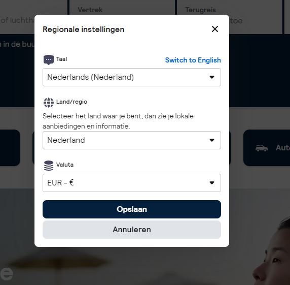
You can also take this approach a step further and allow users to choose region and currency. This is especially handy for e-commerce or booking websites. For example, Skyscanner uses a globe icon in the header that opens a following window with regional settings:

Regional settings at Skyscanner.com
2. Use a splash gateway
Another approach is to implement a splash gateway. When your users open the website for the first time, they’re greeted with a country selector page. Here, they can choose their preferred country and/or language. This selection is then saved via cookies to remember users’ preferences for the next time. When the users open the website again, there’s no splash gateway anymore, but the local content.
The gateway itself can range from a simple dropdown in the header labeled ‘Select your country/region’ to a more comprehensive list of all available languages and regions. Ideally, the names of these languages and regions should be displayed in the respective local language (e.g. ‘Français’ instead of ‘French’).
Here’s an example of this approach from Nikon:

A language button that opens a splash gateway on Nikon’s website
And a longer list from Nivea:

Splash gateway by Nivea
3. Language list in the local languages
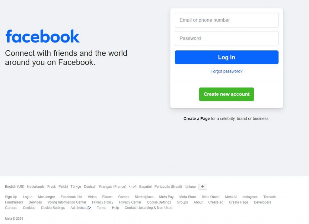
If you’re searching for a more unique approach than a well-established globe icon, you can do what Google and Facebook does. Simply list the language names (plus regions) in the native language at the bottom of the page.

Languages displayed at the bottom of the Facebook’s website
Of course, you won’t be able to list all languages, but you can start with English, followed by languages spoken in the region of your users detected based on their IP.
You can use a plus icon linked to a longer list of all available languages.
4. Use a local language name in the footer
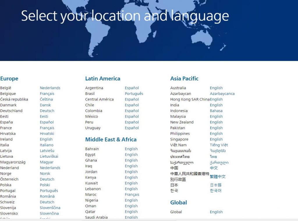
Some multilingual websites simplify method 3 above. They feature a single language name, displayed in the local language, typically found in the footer. Often, this language name is accompanied by a globe or a pin icon like in the case of Coca-Cola. A click on this icon opens a comprehensive language selection window. Again, all languages and country names have to be listed in their respective local languages. A good example of this approach is the following page from Philips:

Extensive language and region list from Philips
5. Use language codes
If you’re looking for something shorter than a language name and less confusing than a flag, you can opt for language codes. This option is a bit tricky, however, as it only indicates the language, not the region. But you can always add an extra country code to indicate the locale, such as EN (UK) for UK English or NL (BE) for Belgian Dutch.
Here’s an example from Dell’s website:

Language codes as a language menu
The button with the language/region codes should take the users to an extensive language selection page with all languages and regions listed in the local tongues.
Final Thoughts
Once you choose the right strategy for your language choice menu you’ll be able to ensure a welcoming and intuitive experience for users from all cultural backgrounds. Whether you opt for a splash gateway like Nivea, a globe icon like Emirates, or a combination of several methods, the goal is to make language selection straightforward, respectful, and accessible.
Are you ready to take your website to a global audience? As localization experts, we can guide you on this exciting journey.
About the author: Dorota Pawlak
Dorota Pawlak is a localization consultant for digital and Web 3.0 brands. She enjoys helping businesses enter new markets and is passionate about cultures, languages, and technology.
Share with friends