How to create a successful global e-commerce website?

What is the recipe for a successful global e-commerce website?
A spoonful of user-friendly design.
Few drops of SEO.
A cup of influencer marketing.
A handful of social media marketing.
A pinch of PR.
A gallon of amazing products.
And tons of localization.
According to Statista, the top global e-commerce website in 2021 was Amazon.com, followed by Ebay.com, Amazon.co.jp, Amazon.de and Rakuten.co.jp.
Let’s explore what “tons of localization” meant in their case:
1. Amazon.com
Since three Amazon sites are among the top 5, let’s start from this giant.
In terms of localization, Amazon’s content is fully tailored to the local markets. Obviously, it goes far beyond changing the language, adapting payment methods or delivery options. Just a quick comparison between the US, Japanese and the German version is enough to notice that the featured products, banners, headlines, menus, and layout differ as well:
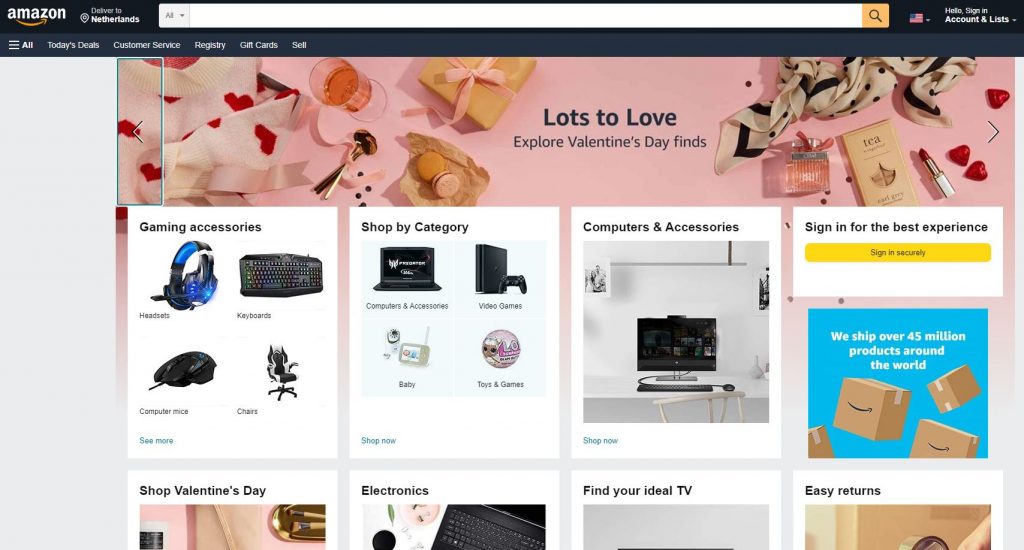
The current homepage of Amazon.com displays a banner for the upcoming Valentine’s Day
There are two more banners—the second one encourages to shop for toys and games, the last one underlines that it’s a truly global marketplace with deliveries around the world.
2. Amazon.de
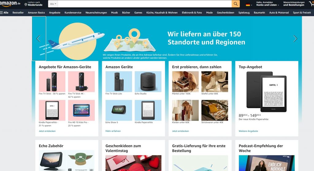
On the German site, none of the banners on the homepage refers to Valentine’s Day. The first banner highlights again that Amazon delivers globally, the other two promote Amazon electronic devices and Amazon Prime Video. The products featured below the banner also differ from the US version. Plus, there’s a clear message that you can first try, and pay later (“Erst probieren, dann zahlen”) which is a perfect offer for cultures that strive to avoid risk, such as Germany (it’s a cultural dimension called Uncertainty Avoidance). The Valentine’s Day does show up, but plays much smaller role than on the US website, which reflects different attitude towards this holiday in both cultures.
3. Amazon.co.jp
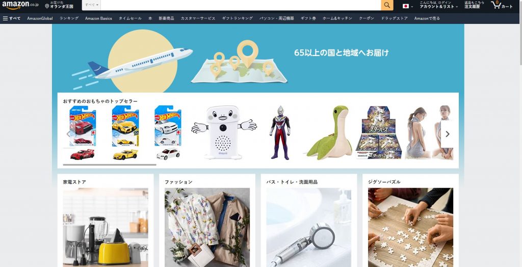
Finally, the Japanese germ. The first striking difference is the layout: there is only one banner saying that Amazon delivers to 65 regions around the world, and again different product categories are listed. Many items featured one the homepage represent local brands, which helps to meet the needs of the target customers and inspire their trust. For clarity, all categories are displayed again on the left side. All in all, there seem to be more fun or game related products (puzzles, cars, robots) than on the US or German website, which again results from the differences between the local customer’s preferences.
4. Ebay.com
As the second-best global e-commerce website, Ebay also tailors its content to the culture and language of the target users. The company has 47 country sites that you can choose from in the menu at the bottom of the page. Since only Ebay.com, not any other local version (de, es or ch) was listed in the ranking, let’s focus on the US website.

The main culturally specific items are visible in the three banners. It’s all about “saving”: discounts everywhere, for all possible products. The focus is on furniture, tech, jewelry, and vehicle parts, which seem to be the most desirable items for the US online shoppers right now. Below the banners, in the featured categories, you’ll see one more way in which Ebay taps into the culture of the target customers: there’s a President’s Day bedroom sale. This holiday is celebrated in the US on the third Monday of February, so the brand uses the upcoming holiday to be locally relevant, and eventually, to close more sales.
5. Rakuten.co.jp
Finally, the last website on the top 5 list: the Japanese online company Rakuten.
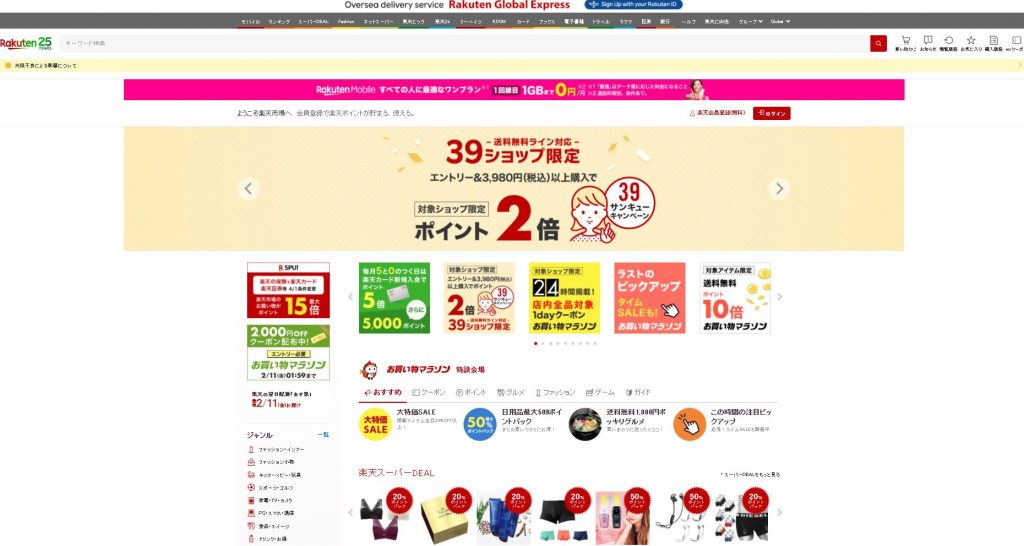
The design is very colorful, playful, with banners featuring comic characters. This layout reflects the preferences of Japanese users who value an “animated” approach to websites. Products on the homepage are quite small compared to other sites developed for American or European users. The focus seems to be on the calls-to-action, promotions and sales displayed on the splashy graphics. It’s worth noticing how much the original Japanese version design differs from Rakuten sites localized for the US, German, or French market. On the screenshot below you can see how the company’s approach varies every time they cross the border.
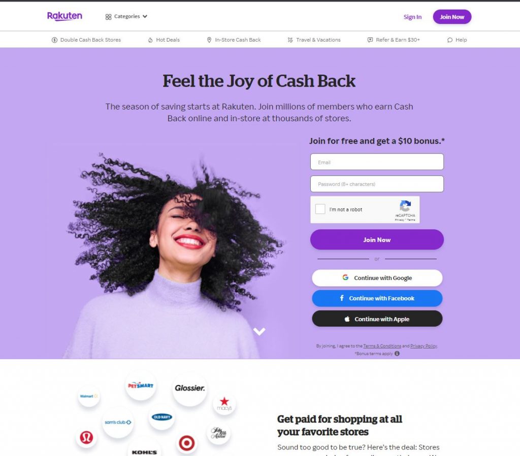
Rakuten.com presents a totally different feel and look compared to the Japanese version
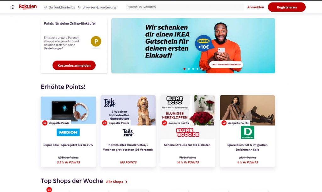
Rakuten.de is also tailored to the German users, and features a coupon for partnering shops
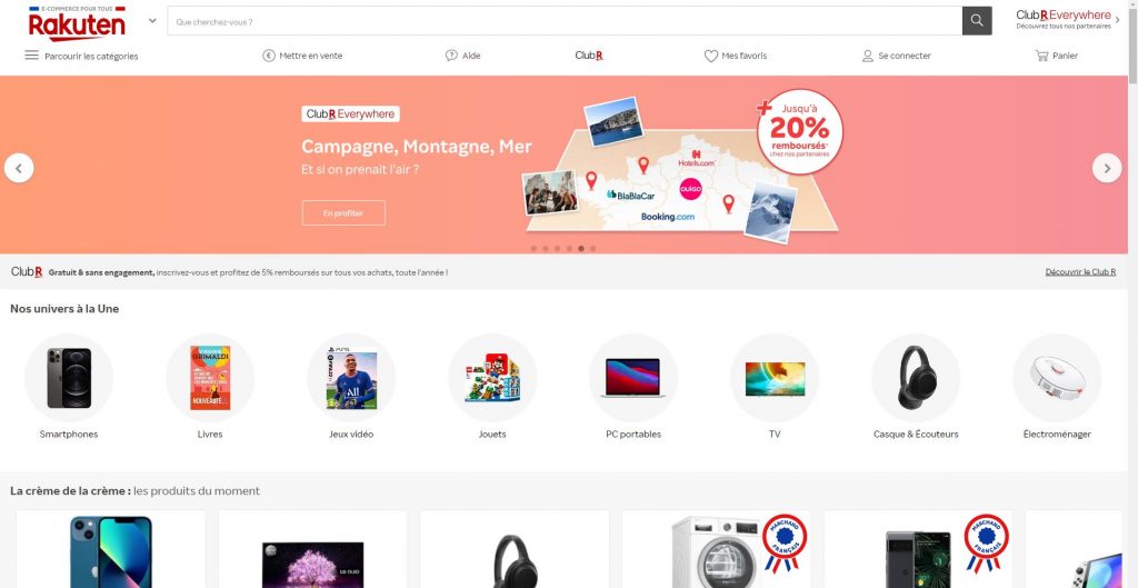
Rakuten.fr also tailored its content to the French-speaking users, and features a local coupon/discount systems
The five top rated global e-commerce websites earned their ranks for a reason. In terms of localization, the websites are perfectly tailored to the target customers in the respective region. The culture, language, navigation patterns, needs and expectations of the local users are all reflected in the design and product offer. No wonder they’ve attracted enough visitors to end up at the top of the ranking list.
There might be many recipes for a successful global e-commerce website. But one thing is sure: localizing your content to the target market will help to inspire trust in your local users, attract more buyers, and close more sales.
About the author: Dorota Pawlak
Dorota Pawlak is a localization consultant for digital and Web 3.0 brands. She enjoys helping businesses enter new markets and is passionate about cultures, languages, and technology.
Share with friends