Take the terror out of the error page: why you shouldn’t ignore error pages when localizing websites
In the ideal world you would never need an error page. But in the real world sometimes things go wrong and website users end up in a place that doesn’t exist, often frustrated that they can’t find what they’re looking for.
For quite a long time now marketers have advised to use the error page as a marketing tool, by displaying funny, creative or surprising content with attractive images. It is a good way to entertain and engage website users, reduce their disappointment or enhance your brand message.
This is why the web is full of unique and humorous pages, such as these:

Former error page of STG
But what happens when businesses and their websites go global?
Are word puns, humor or cultural references also part of that journey abroad? Are the error pages on localized websites also used as a catchy marketing tool?
A quick research proves this is not always the case:

German error page of Starbucks

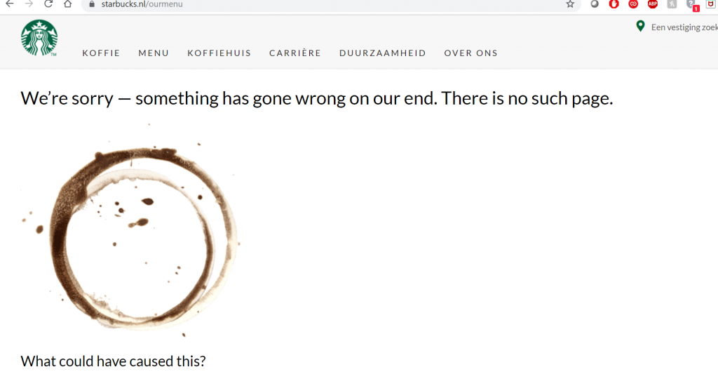
Dutch error page of Starbucks

Polish error page of Starbucks
Starbucks – the same content for all languages, plus in some cases even the language wasn’t’ adapted. For example the Polish and Dutch versions are in English.

Polish error page of IBM

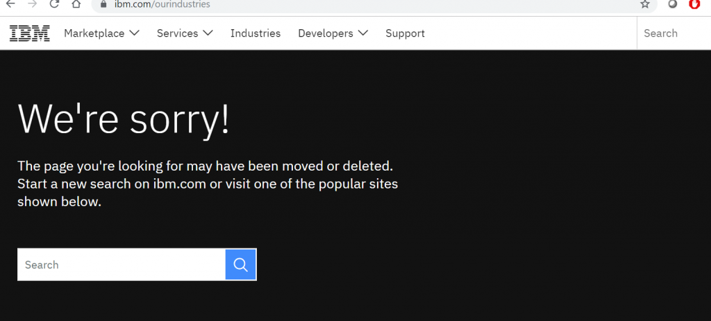
English error page of IBM
IBM – no local versions either, the Polish is the same as the US version, both in terms of language and layout.
So, why exactly is it a good idea to adapt your error page for the foreign users?
Here are three key reasons:
1. Keep consistency
If you’ve already taken the effort to make the error page of your original website funny and creative, why not adopt the same strategy for other cultures?
Ask your localization team – translators, localizers, or graphic designers – to help you create a catchy content for your target audiences. You may want to add some cultural references or word puns in the target language to show that you know and care about the culture and environment of your users abroad.
Similarly, if you’ve already taken the effort to localize all other pages to the new market, why omit the error page?
It might now be displayed as often as other pages, but a localized error page will definitely help you to…
2. Entertain and retain your foreign users
When you localize a website every little item counts: from menu lists, through images, logos and search bars to buttons, contact data and error pages. To create a trustworthy image on the foreign market and convince your users to keep coming back to your website, you’ll need to show that you do act locally.
One way to do it is by adding content that feels local: images with local artefacts or landscapes, promotions for the local holidays, texts about the local events or references to the local culture. An error page can be a good place to season your message with some regional spices. In this way you’ll stress that you’re with your foreign users for better or worse and that…
3. Your users are not that foreign at all
Whether or not you decide to create an original error page for your original website, the localized version is a good place to show your brand’s creativity.
With or without cultural references, a unique error page in the language of your target audience adds an extra level of confidence and trust. Of course, you’ll need to remember to include links to other pages on your localized website: home page, contact page, popular blog posts or other resources and display a search bar on your error page. In this way you’ll help your users to quickly navigate away from the broken link, which can encourage them to explore your content in the local language and prevent them from closing the browser tab, feeling misled or confused.
Error pages don’t have to be blank, boring or swept under the carpet very quickly. You can use them to enforce your brand image, also on the localized version of your website. Adapt any humorous content, cultural items or references to the target market to surprise, entertain and retain your audience. Localized error pages can be a great tool to show that you value your users and know their culture very well.
About the author: Dorota Pawlak
Dorota Pawlak is a localization consultant for digital and Web 3.0 brands. She enjoys helping businesses enter new markets and is passionate about cultures, languages, and technology.
Share with friends
